The announcement of the results from the European Space Agency’s Planck satellite has generated renewed interest in the idea of a single image of the entire universe, in particular a snapshot of its state shortly after its birth.
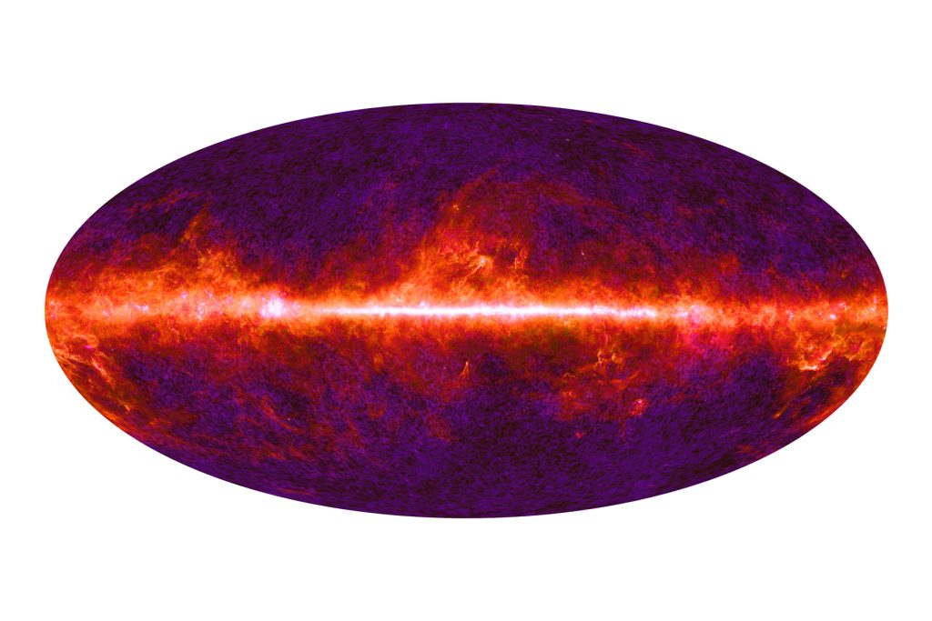
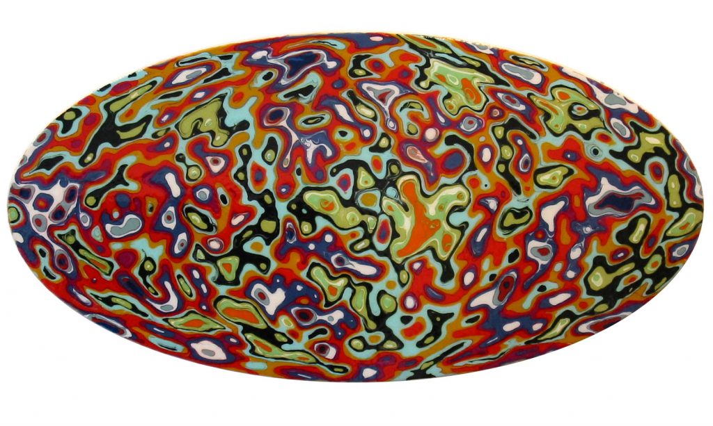
I have just completed a digital art project using the raw data from the Planck mission. I created a new, high-resolution all-sky image, using the 9 channels of microwave data:
Microwave Universe, dgital print on archival paper, 24" x 36", 2013
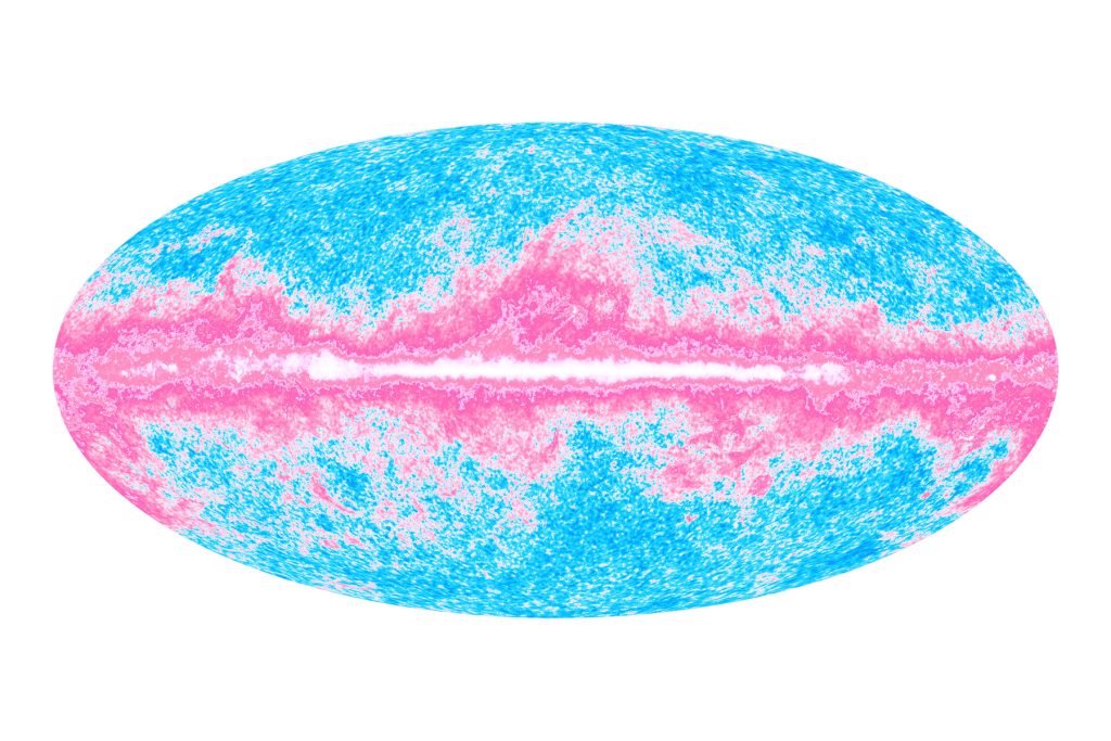
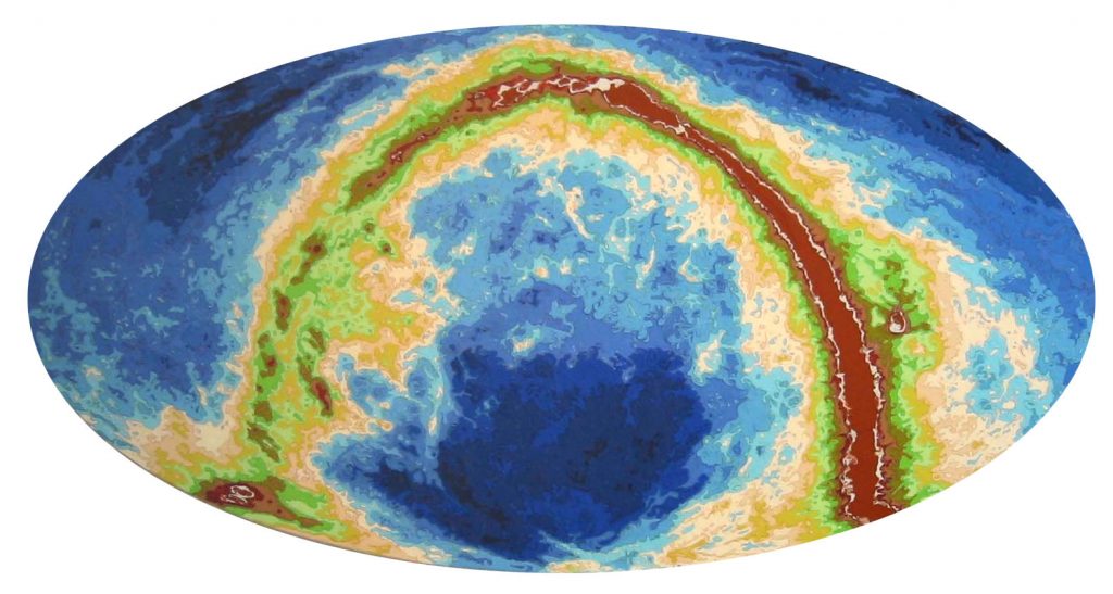
I then created another “interpretation” of the data using a different color mapping for the data, to suggest a baby picture via color:
Universe Baby Picture - Planck #1, dgital print on archival paper, 24" x 36", 2013
Is one of these images more “natural” than the other? More intuitive? More useful? More beautiful?
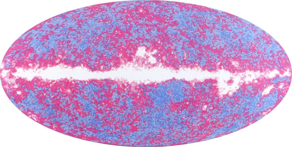
This project was inspired by an earlier painting project dealing with the same subject matter. A decade ago, I made a painting of data from the WMAP satellite, Planck’s predecessor in studying the Cosmic Background Radiation.
Universe Baby Picture (5-color WMAP), acrylic on canvas over panel, 36" x 72", 2003
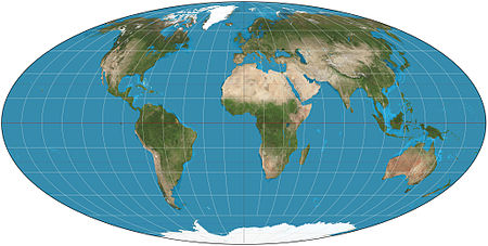
This painting was part of the Macrocosm series, where I used data generated from various orbiting observatories. The oval format comes from the elegant Mollweide Projection, which maps a sphere onto an ellipse, preserving area (although somewhat distorting shape, especially at the edges.) This is the mapping used to produce the familiar fat globe showing all the continents at once:
Mollweide projection
In this case of the satellites, the sphere being mapped is the celestial sphere – what you would see if you could look out in all directions at once, without the earth getting in your way. Even a satellite has a little problem in seeing out to deep space in all directions, namely the fact that it is embedded in the Milky Way. The challenge is akin to trying to take a photograph of every surface of the inside of a subway car, while standing in the middle of it during rush hour.
The data from this mission was very painstakingly gathered and analyzed, and all the radiation from all known local sources was removed, to end up with this latest and greatest image, which was seen around the world (and featured on the front page of The New York Times, above the fold):
Planck CMB
The anisotropies (i.e. the variations in warm/cool color in the image that indicate minute variations in the background radiation) are seen in ever greater detail, but no obvious structure (except perhaps for a tantalizing similarity to the image of the continents above…).
When I first saw the images from the earlier WMAP project, I was struck by their visual beauty, and their conceptual clarity. The notion of depicting the entire universe at once was striking. I found myself drawn to the intermediate images in the process, where the Milky Way was still visible. This became a strong motif of the painting that resulted, a counterbalance to the very strong form of the oval panel.
As an artist making paintings from data, I felt free to remap the data to new colors to suit my pictorial purposes. Scientists often ignore the visual implications of the colors they choose, choosing them as though the only meaning that color carries is that of visual differentiation (in other words, that the viewer can distinguish one color from another, and hence “see the data” as clearly as possible). An artist sees color differently – color is embedded in a pictorial language that has vast and rich associations throughout all of visual culture. Color can be associated with emotions, ideas, ideologies, styles, eras, places, etc.. Meaning and association cannot be separated from color. Every choice of a palette, no matter how seemingly neutral, has an effect.
In the case of Universe Baby Picture, I came up with a color spectrum that related to the idea of the infant universe: pink and blue to suggest the colors of the blankets that newborns are swaddled with in hospitals. I preferred the image with the Milky Way left in as a “creamy center” (in Martin Kemp’s phrase), like some amazing Fabergé egg about to crack open.
Other paintings from this series used the data to different pictorial ends. In the painting Cosmic Microwave Background (2001) the Fabergé egg idea is pushed to an extreme:
Cosmic Microwave Background, acrylic on canvas over panel, 24" x 48", 2001
To create this painting, I replaced the original color spectrum of:
With this one:
In the painting Island Universe, I substituted a deep sea-shallow sea-beach-forest-mountain spectrum (such as a mapmaker might use to show elevation) for the original NASA thermal spectrum to create an image that suggests the entire universe as a coral atoll in the Pacific:
Island Universe, acrylic on canvas over panel, 48" x 96", 2002
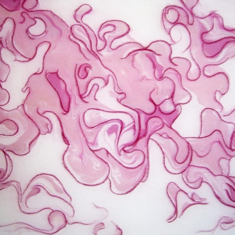
One thing that is hard to convey in small images on the web is how the surface of these paintings is made of swirling paint and drawn lines. Paintings are also physical objects, and the tension between their status as disembodied images and as objects is particularly interesting when the subject of the painting is data. Painting is an analog medium, so when we push past the digital resolution of the original data, we reenter a realm of fluctuation. As paint mixes together, it forms complicated boundaries. I enhance these borders with drawn pencil lines (using a procsess of layered and poured acrylic on top of the paint, which allows me to create a flat surface suitable for drawing). The outlining depicts (imagined) three-dimensional structures that interrupt the two-dimensional conception of the original data. Consider this tiny detail from the center of Universe Baby Picture, the paint has swirled into complex forms well below the scale of the pencil lines I have added to define the primary forms.
detail of Universe Baby Picture, showing ~ 10cmx10cm of the central area of the painting (<1% of painting)
Just like its subject matter (i.e. the universe itself) the painting reveals structures inside structures, as close as we care to examine them. Painting and drawing have always been used to explore our place in the universe. Leonardo would not have recognized a great distinction between the drawings he made of his inventions, of his studies of anatomy and natural phenomena, of his plans for fortifications and spectaculars, or of his preparations for his painting projects. They were all part of disegno, the process of both designing and apprehending the world. As mankind’s collective knowledge grows ever vaster, the age of a “Renaissance Man” or polymath who operates in the “Two Cultures” of art and science seems past. But perhaps there is something to be gained in remembering that art and science are inextricable strands of a single thread of human inquiry.