These images are all depictions of the entire universe, seen from the earth, looking out into the cosmos in all directions.
These oval images are based on the Mollweide projection, which is a way of mapping a spherical surface onto a flat surface, with minimal distortion. If you imagine cutting the oval shape out, and bending it around the long axis, you can see how it relates to the celestial sphere.
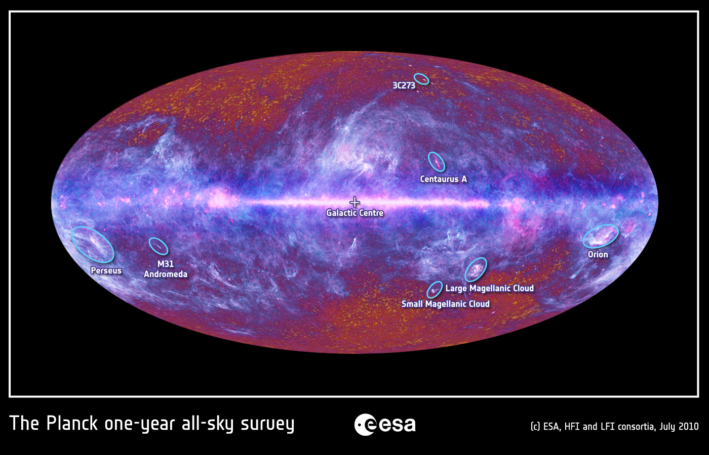
The central white form is the Milky Way galaxy. The images are oriented to the galactic center, using galactic coordinates. If you have ever looked up on a clear night and seen the milky way glowing as a line across the sky, you will recognize how this image is oriented. Bright spots correspond to other strong microwave sources, some relatively nearby, others more distant. This image identifies some of these, such as the Magellanic Clouds and the Andromeda galaxy.
The European Space Agency’s Planck satellite was designed to do a complete microwave survey of the universe, at a higher resolution than any previous mission. The major scientific question of interest was to study the Cosmic Microwave Background radiation (CMB), the echo of the Big Bang that is observed everywhere in the universe. The CMB, originally thought to be completely uniform, has been observed to have slight variations. Scientists hope to gain insight into the early universe by studying these variations. An excellent description of of how the CMB was observed and analyzed by the Planck scientists can be found at http://sci.esa.int/planck/51551-simple-but-challenging-the-universe-according-to-planck/.
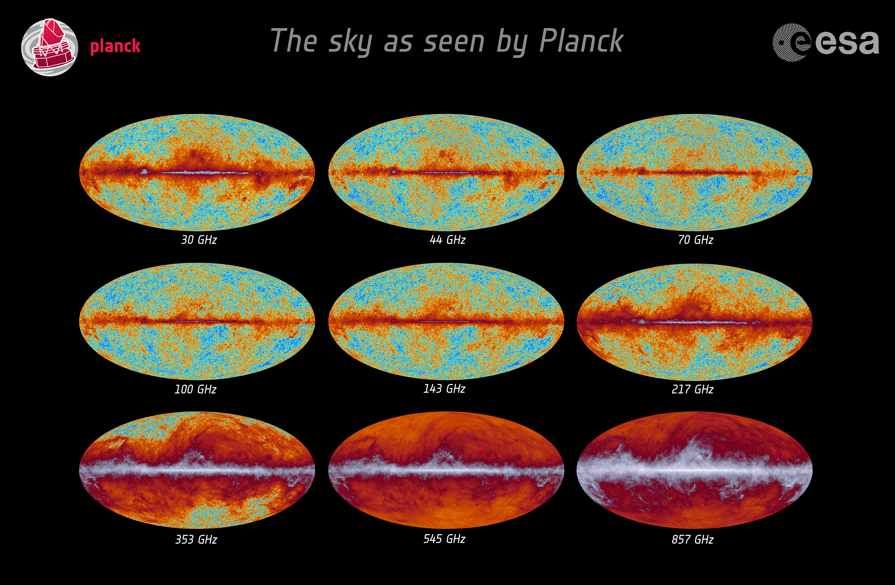
The Planck satellite performed a multi-year mission, observing the universe in every direction, and taking measurements at nine different channels, all in the microwave spectrum. Thousands of scientists and technicians were involved in the planning and execution of the mission, and the analysis of the data. This data was published, and I downloaded it. I created the images in this series using astronomical software (Aladin/CDS) to handle the data and create monochrome single-channel images, and imaging software (Photoshop) to create layered, composite color images.
The Planck dataset (e.g. available at http://irsa.ipac.caltech.edu/data/Planck/release_1/all-sky-maps/index.html) contains many versions of the mission data. The raw observation data was cleaned and processed in a variety of complex ways. I ended up using the cleaned “sky-map” version of each of nine channels from the HFI or LFI detectors: 30,44,70,100,143,217,353,545, and 857 GHz. For the image Universe Now and Then I also used an additional three channels: the Cosmic Background Radiation, which was calculated in three different ways, and distributed as SMICA, NILC, and SEVM.
The data for most channels was collected in a 1024×1024 equal-area grid (HEALPix coordinates). This means that each channel has one megapixel of grayscale information. Thus the data for each of the images in the show contains 9 or 12 megapixels . When this information is mapped with a Galactic Mollweide projection, individual pixels appear as diamond shapes, which can be very faintly discerned in the images here. The color images were built from layers of projected and upsampled data, to reach the 34 megapixel color resolution of the prints. The layers were combined in Photoshop using a wide range of blending and adjustment options to bring out the maximum amount of visual detail possible and to remove projection artifacts. The final Photoshop file contained over 80 layers, and required over 2 gigabytes of storage.
The satellite “sees” in the microwave spectrum, at far lower frequencies than visible light. To visualize the data, it is necessary to assign colors to the different frequencies. This technique is sometimes referred to as “false-color”, although that designation makes more sense when “natural” colors are replaced by others; in this case most of the radiation depicted is simply not present in the visible spectrum. Therefore the choice of color for a visualization is (or can be) a free one. In each of the three images, I used that freedom for different purposes.
For Microwave Universe, I chose a somewhat natural palette, suggesting a “white-hot” glowing center, cooling to a dark periphery.
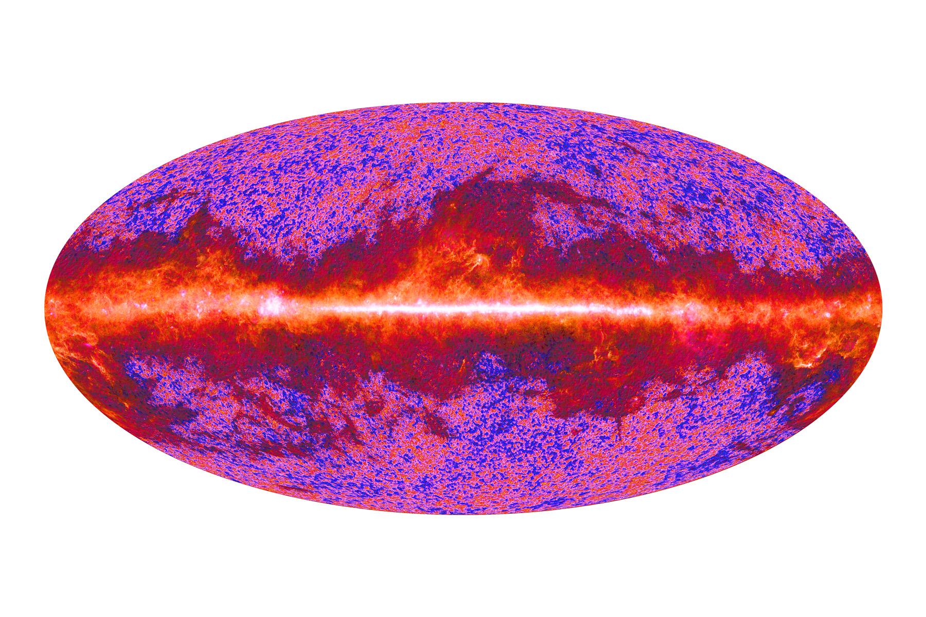
For Universe Baby Picture – Planck # 1, I playfully altered the spectrum to suggest the canonical colors of infancy – the pink and blue of hospital swaddling blankets.
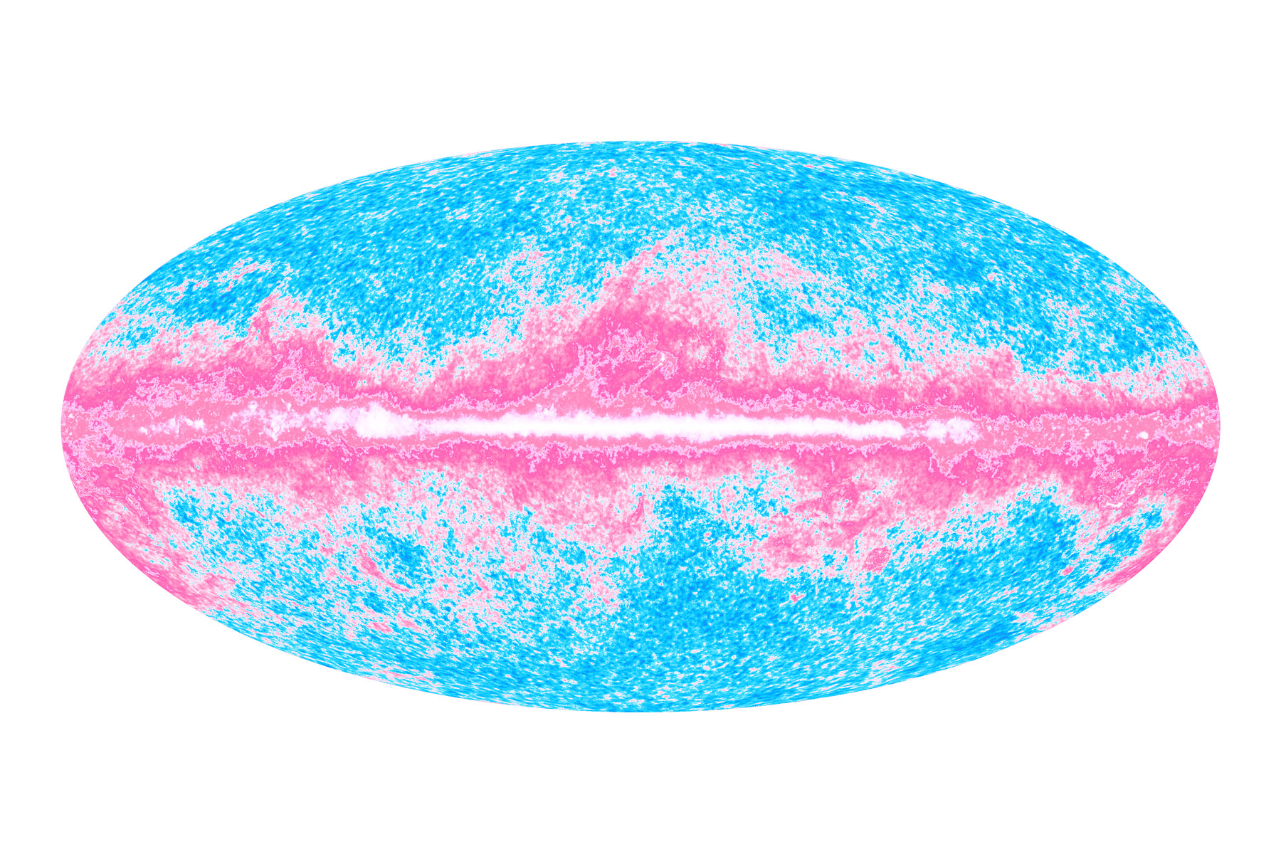
For Universe Now and Then, I superimposed the microwave foreground onto a background of the CMB radiation, using a much more restrained version of the baby-picture palette.
The European Space Agency produced a visualization of the Planck All-Sky data (e.g. here: http://spaceinimages.esa.int/Images/2010/07/The_microwave_sky_as_seen_by_Planck). Their color and compositing choices were different than mine. You can also see their visualizations of the individual channels: http://sci.esa.int/science-e-media/img/6b/Planck_composite_all-sky_Frequency_BLACK_v5.jpg.
As an artist who has used scientific imagery for many years, I have always been interested in the way that color has been used in visualizing data. I made a series of paintings called Macrocosm, all based on astronomical images. When NASA’s WMAP satellite (Planck’s predecessor) mapped the CMB starting in 2001, people began to refer to the resultant images as “baby pictures of the universe”. I was inspired to create a painting using the “baby” colors of pink and blue. I used an oval canvas as a support, for its further suggestion of birth.
One of the features of the painting is that it has a wealth of chaotic, invented detail that was not derived from the WMAP data, but that is intrinsic to the physical process of making a painting. The relative low-resolution of the WMAP survey compared to Planck was ideal for this (mis)use of the data. When the Planck data was released at a much higher resolution, I was inspired to make my first all-digital works, creating a more-or-less straight interpretation of the data.
I take it as artistic license. Strictly speaking, it is the CMB, visualized on its own, that has most often been referred to as the “Baby Picture of the Universe”. However, when I examined the NASA images showing the process of analytical subtraction that was required to see the CMB, I found the intermediate images more visually compelling. I decided to leave the Milky Way and rest of the foreground in the original painting (and again in the print).
The print Universe Now and Then is an attempt to follow my original artistic impulse (to use a pink-and-blue-color gradient to represent the CMB) but still make an image that had a more direct scientific meaning. In this image the microwave foreground and background are visualized at the same time, but also clearly distinguishable.
All three prints are visualizations of the original data, and although I have deviated from the standard conventions of astronomical visualization, I believe they are valid images. Much of my work as an artist dealing with scientific imagery has been in exploring and making visible just such conventions of representation.
Clearly the Universe Baby Picture print uses a palette that prioritizes aesthetic pleasure over differentiation of fine structure. However, Microwave Universe and Universe Now and Then are attempts at a natural rendering that I hope will reveal nuances in the data that were not visible before. I created Universe Now and Then in response to feedback from some of the Planck scientists, who suggested that it would be interesting to see the Microwave foreground rendered on top of and in contrast to the CMB.
– Jonathan Feldschuh, September 2013